
Step-by-step essentials you shouldn’t miss in order to make the most of your flight booking engine. In the first piece of our three-part article, we will start our journey by the first steps of selecting a flight, alongside our insights about designing a smooth experience.
Engineering an airline booking flow might seem obvious – all you need is to sell a flight ticket to someone who probably desperately wants (or needs) to travel. There are a few mandatory stages to go through, and off you fly: both your customer and you are happy. But those who have been there know that designing an easy booking experience is everything but easy. There are many necessary details, best and even better practices, and crucial edge cases to be taken care of, if you really are to increase your revenue. With ten years of experience in aviation, believe us, we have been there. Done that.
At Mito Digital, we constantly aim for the sky. Among our global clients is the best performing ultra-low-cost carrier (ULCC) in Central and Eastern Europe, Wizz Air, for whom we have been delivering smart digital solutions since 2011. For the Icelandic startup airline PLAY we designed and developed an Internet Booking Engine (IBE) worthy of the name: it displays some playful and well, sometimes unordinary elements as well. It was launched in December 2021, and we’ve been flying together ever since.
In our upcoming series of articles, we will tell you everything we have learned about designing a great booking journey – and a great UX. Either you are a low-cost carrier raising revenue mainly from ancillaries, or an airline focusing on ticket sales, the very foundation of a booking flow is always quite similar: giving users some comfort during this somewhat stressful process.
As for the core online flow, we have identified six simple steps to go through:
- Where From and To – When – How Many
- Flight selection
- Passenger(s)
- Baggage
- Seat(s)
- Summary / Payment
We believe that in the first place it is always the basics that should be right. Nice-to-haves and other extras only come after. In this article and the next two ones to come, we will delve into these basics, and tell you all about the must-haves you shouldn’t miss when it comes to designing the steps above.
Where from / to – when – how many
Three questions out of the famous “Five Ws”. That is what every booking engine starts with. Where, when and who (well, rather how many) are the principal matters to ask the user to be able to show actual flight dates and prices later. And while the order of these elements is usually standard (and really, there is no point in changing it), their placement on the website can definitely vary – with them being either on the same or various screens. Mostly, they are displayed together in one search box with a CTA button – while in the case of PLAY, for instance, these questions are split into three separate steps and screens. Although brave ones can even skip the traditional “Where to” question and replace it with some new concepts, such as a well-designed inspirational search field (well, we have other cool ideas, too).
From / To?
Where does your user travel from – and where (s)he wants to travel? As step zero, this is an elemental part of the main page. The question is, to what extent? How does it integrate with the hero image or other promotional bits? Does it appear as a box or as a single line? In our experience, to make it visually pleasing is rather a UI decision, and the solution probably does not affect the actual behavior of the user.
To identify the place of departure on the basis of one’s IP address is not so obvious anymore. Even if location is allowed on a device, other technical limitations could occur. And if they can, they will (well, tell us about it.) However, where possible, the From field could be pre-filled, with a much greater focus placed on the destination itself. The most exciting part for us all, obviously.
Many are struggling with the below the fold content, but we have good news (or bad ones, depending on your perspective): in our experience, users don’t really care about banners and other promotions trying to catch their attention. Not at this point. Rather, they focus on their goal: the flight search or the support content they specifically came for. Sure, you can make it all nice and cool but a full screen hero image with a search box in the middle would probably work just fine.
Currency preference
It is important to provide the option of selecting the currency already at the very beginning of the flow. In the case of the website of PLAY, there is a helper inline message stating your current currency and language, suggesting to change those if needed.
When?
What calendar date intervals should be displayed for the user to select from? A range of days, weeks, maybe even months? (Don’t we all wish we could travel for three months in a row?) Well, in our experience, one month is simply not enough. If possible, showing a two-month period besides one another is the best you can do. On desktops, dates are usually shown from left to right, while on mobile devices it is from up to down.
Another matter that is worth considering is the way you handle round trips vs one-way trips. When in the flow can one decide, and how user-friendly the selection is? Our solution for Wizz Air was setting one-way travels as a default – but once users click to choose a return date, it would automatically become a round trip. In other cases, passengers need to select it explicitly as a step zero. Although, as we see it, that is not the best practice.
It is important to note that prices are usually cached here, as due to backend issues it’s not possible to show real-time, detailed fares yet. Meaning disclaimers are very much needed here.
Extra features
To these three (or two) steps above you can already add upsell options and other nice-to-have features. By doing so, you add an inspirational layer to the basic flow, either confirming the user in his/her choice, or altering that. Based on the destination, this could be some thrilling information about the city (for example, use icons that represent the main opportunities). While based on the date, this could be some financial insights on the cheapest prices, maybe details on occasions and events (such as Valentine’s Day, a music festival or some very local and a little weird tradition). Of course, you can always integrate third party ticket sellers as well. Don’t worry, we will cover that topic later on, too.
How many?
This is basically the most basic step of all. Providing the number of passengers in advance is needed because the flight price shown will be the cheapest one that is available to them all at the same time.
A passenger can either be classified as an adult, youth (in some cases, in some countries – e.g. tax reasons in England), child or infant. This information is also essential for knowing what details should be asked later – like the date of birth in the case of infants.
Speaking of which, if an infant is added to the passenger list, a lot of extra information and services could be added as well, such as extra bags, handling the stroller, a car seat or traveling with lap infants. Still, in many cases, these are being missed. And anyone who has ever tried to manage flying with a toddler, knows exactly how crucial these details could – and should be.
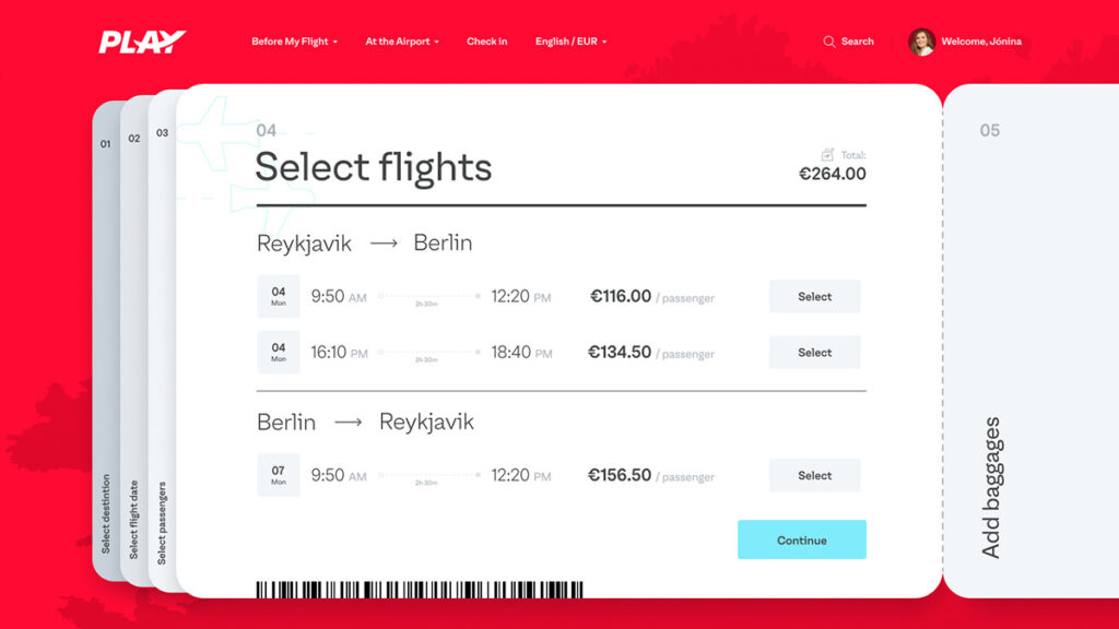
Flight select
Okay, so all the available flights are listed. But listed how? If there is only one option available, is it preselected? (Well, should it be at all?) If a round trip has been picked before, are the options displayed on one or separate screens? (Even if it is a one-way trip, we once again offer the possibility of a round one as an upsell best practice.) Is there a layover (in the case of ULCCs, there usually aren’t), perhaps even a stopover with a night spent at the intermediary location?
Here comes the matter of bundle selection too. These are basically predefined services in different packages, usually from a basic to a pro level (with all the goods such as extra bags, priority boarding and seat selection). Sounds nice? Making these bundles dynamic and personalizable so that the user is able to set up his/her own one, based on his/her own preferences would be even nicer. Although, this is often a question of product development rather than UX.
Once selected, a good bundle should be an integral part of the booking flow in an unalterable way – meaning you can’t remove, say, that extra checked-in bag, not even by accident. Because, let’s be honest, sometimes those happen too.
The cool thing is that at this point, there is no need to convince your customer of traveling. (S)he definitely wants to travel, and knows exactly where to. You are good. Which means, you can start getting to be a bit more playful in the UI. From this step on, a lot of data is mandatory to be displayed, such as destination, price, duration or the flight number. And while the elements of a dataset remain the same in each booking journey, the look and feel can be different – and can make a difference. Just imagine visualizing it as a boarding pass.
Accessible design
Accessibility could – and should be a bigger deal than design. Or even visual identity. If the colors of a brand are not accessible enough, it has all been in vain. For instance, due to contrast issues, we had to darken the official PLAY red, even though many might not even recognize the difference. Also, we had to choose a darker gray for the days passed in the calendar (yep, sometimes even things which are not really there should be visible). But bear with us, or even better, subscribe to our content: in a future piece, we will dig deeper into the topic of accessibility as we believe it’s one of the cornerstones of outstanding UX.
An important question to decide is where in the flow the forced / mandatory login should be put. The industry trend is to place it after the “Flight selection” step, which we believe is kind of an outdated practice as it doesn’t support inspirational search. Say, you would like to see how much it would cost you to travel to Costa Rica. But as you can’t even add bags without logging in or registering, you might end up getting driven away from it all instead. In general, the less input fields the user meets, the further (s)he will make it through the booking flow.
From a UX perspective, it’s better to place the login form much later. However, in real life, technology and UX are just not always on the same page. For Play, we suggested making it the last step of the flow – but then, backend limitations happened.
Also, if there exists a frequent-flyer or other loyalty program (those who have seen the movie Up in the Air surely knows how cool collecting air miles is), it should be communicated here, together with a required authentication.
Availability and price change
When it comes to flight tickets, there is no such thing as holding them. You might have selected a seat which might be already gone once you are about to pay for it. Airlines such as Wizz Air simply can not afford the luxury of holding flights, prices or seats. Although, there is usually too little information on that.
We are not yet halfway through the process. Passengers are still to be named and seated, bags are still to be packed, overviewing the process and payment is still due. Don’t worry, we will get to those in our next two articles, as we continue exploring how to make users your passengers by designing a smooth booking experience.
Thank you for flying with us along the journey!
Our articles on flight booking engines will be published every now and then here, at Mito Digital Blog. For our next piece, be sure to subscribe below, or you can always contact us.
Mito Digital is a business unit of Mito, a unique powerhouse of creative & digital experts with a passion for clever things. We have been working with our clients around the globe for more than ten years, in numerous industries from aviation through lottery and retail to telecommunications. Our goal is to design and deliver smart, human-centered and best-in-class digital solutions that meet and exceed the business goals of our clients as well as the demands of their clients.
The author(s)
Richárd Deák
Business Unit Director, Aviation
Richard – or rather Richie – is a true aviation professional. Being responsible for airline clients, he has been leading Mito Digital's respective business unit since 2015. Thanks to his over 15 years’ industry experience, he knows it all about leading teams and building top-notch interfaces that millions of customers use around the globe. Also, he is president of the Hungarian Ducati Owners Club.
Klára Pálossy
Content Writer
Klara writes about digital for people who love digital stuff, mostly in digital form. Be it aviation or lottery, design or mobile development, she is on the lookout for good stories at Mito Digital, and has a genuine interest in how to make the digital world a better place for users. Sometimes, she writes analog style too – shopping lists and haikus, mostly.
")
")